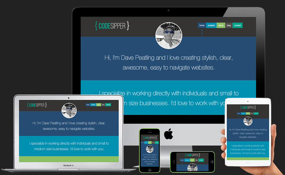
The Benefits of Responsive Design

The growth in mobile internet can be likened to the speed of Tesla founder Elon Musks Hyperloop project to connect people from Los Angeles to San Francisco in 30 minutes. The Hyperloop will carry passengers at speeds of up to 800mph, the mobile internet market might not be a Hyperloop but it’s definitely in hyper-boil. By the end of next year it’s projected that more people around the world will be viewing the internet from a mobile device than there will be viewing via desktop.
Although this is terrific news generally, viewers have easy internet access 24/7 and business’s have their ‘shop window’ available inside everyones pocket, it does create a challenge when it comes to web design.
What looks great on a 27” iMac wont look so good on an iPhone or Nexus 5 or indeed the multitude of screen sizes in between. This is why, with the majority of sites at the moment, you need to zoom in significantly on your smartphone to be able to read the site. You then have to scroll left, right, up or down to find what you’re looking for. The problem is even worse when it comes to navigation, menus or links. What was easy to click on with your mouse now becomes a bit hit and miss with zooming and touching.
Responsive design uses CSS3 media queries to adjust the layout to ‘respond’ to the screen size the site is being viewed on. It can adjust simple elements like the font size, move the position of sections of the site, as well as re-size images and much more. For example, on a desktop screen the site may look great with a 2, 3 or 4 column layout but how about on your smartphone in portrait? Here it would look significantly better if it was consolidated into a single column with drop down menus to navigate to other sections.
The beauty of this method is that the site is coded just once, with, for example, HTML5, while all of the manipulation is being done through CSS3. As far as search engine optimization is concerned Google recommends this method as being the best for indexing your site and giving it a higher ranking in searches.
An easy way to see if the site you’re viewing on desktop is responsive, like this one, is to just drag the bottom right corner of your browser window and make it smaller. As you size down, the flow and layout of the page should change. This will give you the idea but better still grab your smartphone and compare the different layouts. Then marvel at the power of CSS3 … and of course your web designer.