International Jazz Day
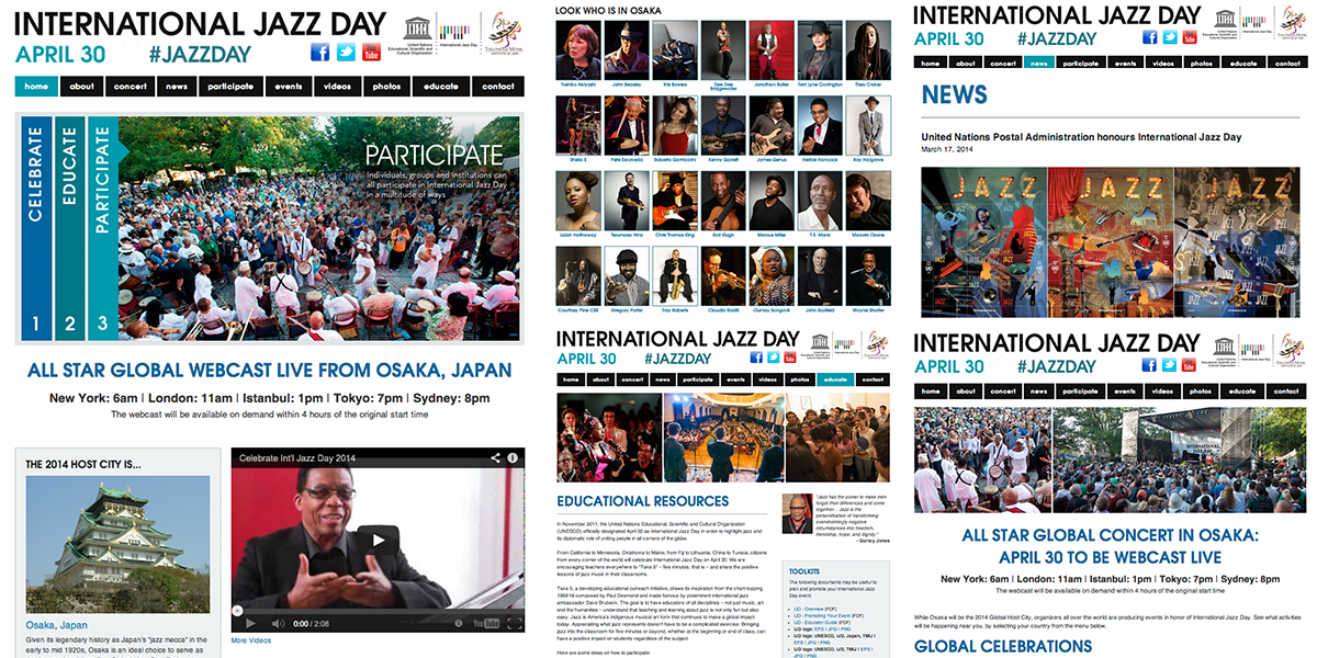
The New York company tasked with organizing the marketing of International Jazz Day on April 30th, asked me to be part of the team for the update and global launch of the 2014 website. I was pleased to be on board with this prestigious global event which this year is being hosted by Osaka, Japan and is backed by UNESCO and the Thelonious Monk Institute of Jazz.
The site features video streaming of the concert in Japan on the day, as well as a comprehensive list of the performing artists that reads like a who’s who of jazz. Various events are being held around the world in conjunction with the day and the site offers comprehensive support and downloads to assist these.
A page that includes all of the various press releases from around the world is accessed from the main navigation and these articles are also excerpted on the home page.
I'm proud to be involved with this project and credit goes to the whole team involved.
You can follow the event on Twitter, from their Facebook page or at Jazzday.com
run4nachos.com
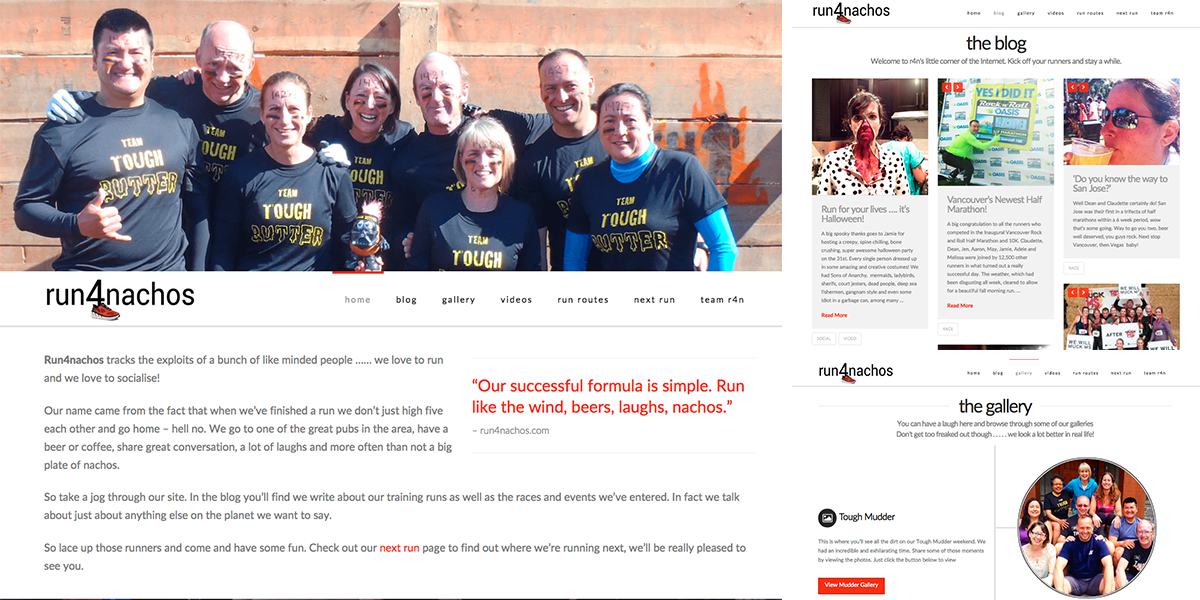
A group of runners contacted me as they wanted an easy to update site where they could co-ordinate all of their runs and social events. The blog section was important as they were keen to have as many people as possible involved in the content of the site.
They wanted to have featured images and excerpts of the content of each blog post available to browse on one page. For this I created a masonry effect for each post with three across the page. The featured image was also enabled to hold a video or a gallery
Other pages included a videos page which collated all of the posts that included any video within them as well as a next run, run routes and a team r4n page, featuring the members of the group.
Wedding RSVP
Having sent traditional wedding invitations to friends and family all over the globe, Andy and Kristin wanted to make it easy and uncomplicated for their guests to respond.
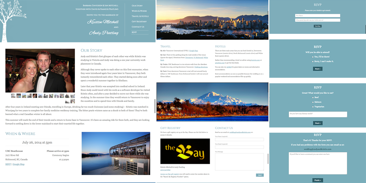
I developed a website for them that would not only collect these responses but would also give their guests more details about the wedding, venue and local information.
A slideshow gallery was incorporated underneath the header section which displayed photographs of the couple as well as the story of how they both met. Below this I included sections detailing travel information and local hotels, all with google map links for directions. This was followed by a section that linked to a gift registry along with a simple contact form.
Finally a custom coded RSVP form was created where the guests could fill in their details and select from various options including menu choice and dietary options. On completion of the form an automated email is generated which is sent to the guest confirming their acceptance and the various choices selected.
N.J.Popham
N.J.Popham is a steel building manufacturer based in the United Kingdom. The owner, Neil Popham, approached me to design and develop a web presence for the company. He wanted a site that was simple to read and not over complicated by technical phrases and terminology.
Running throughout the site is a scrolling testimonial feature which emphasizes the many satisfied customers he has and gives confidence to prospective clients.
I incorporated a steel blue and grey pallet which was soft on the eye and I highlighted the privately owned and run aspect of Neil's business. A projects page was included to highlight the most recent jobs Neil had completed together with a brief description of what these job entailed.
Cariboo Coffee Company
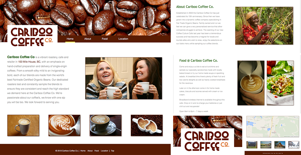
Cariboo Coffee Company in 100 Mile House, BC, Canada contacted me to design and develop their company site. The brief was to create a clear, easy to read, uncomplicated site that would inform prospective clients of who they were and what they can offer them.
Their company logo was incorporated into a striking header image with site navigation alongside. A location page included a dynamic Google Map, for ease of route planning, as well as contact details and an email link.
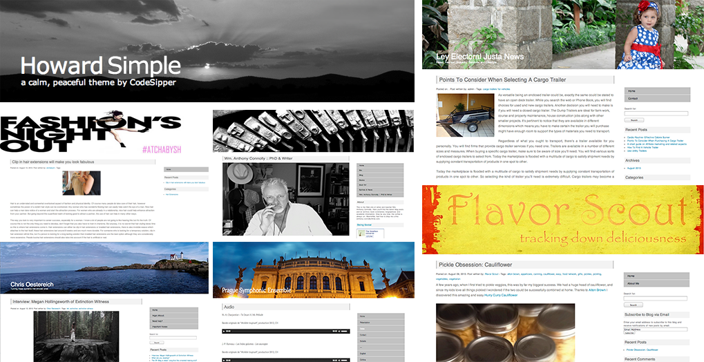
Howard Simple
Howard simple is the basic version of my full Howard theme. This theme is intended for those who have no need for all the bells and whistles that come with the full version. Howard simple is a clean, neat theme for users wishing to get up and running fast with a blog.
This is a two column, right-sidebar, flexible width WordPress theme with widget support. It's now been downloaded over 6,000 times in countries far and wide from the USA to Russia to the Czech Republic. You can download the theme now by going to the WordPress theme repository.
Howard
This is the full version of my Howard theme which will be coming out shortly. Here I'm showing it in both a warm vivid color pallet as well as a calming monochrome style. The theme utilizes a full width header image which gives it that striking look.
This full version includes recent article thumbnail images, widget supported sidebars, full video clip support, social media feeds as well as click through social icons in the header and an image gallery.
