CodeSipper - Vancouver BC Website Design and Development

Dave Peatling

Menu

Main Navigation

  • home
  • projects
  • about
  • blog
  • contact

Hello Mudder . . . .

January 24, 2014.

One Comment

2014 Tough Mudder Extreme Endurance Challenge

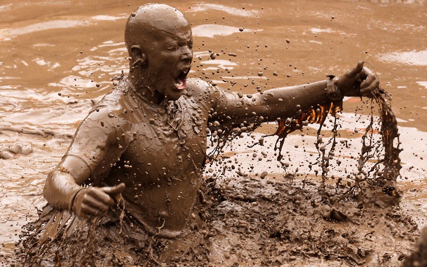
Last week I signed up for my very first Tough Mudder. This one is being held up in the mountains at Whistler, BC.

For those of you who don’t know what a Tough Mudder is, it’s a hardcore extreme endurance challenge designed to test your all around strength, stamina, mental grit and camaraderie. It’s run over a distance of 18k (about 11 miles). They throw everything at you including electric shocks, baths of ice, incredible structures to climb and of course, acres of mud.

I’ve entered with a group of friends from our gym with the emphasis on pulling together as a team and helping each other to get to the finish line. We hope we’ll be able to look back at what we’ve achieved with pride – and a beer or two.

This got me thinking about the similarity of the Tough Mudder to how a website is put together. You have your initial goal of what you want to achieve, then set about the task with the help of your team mates.

So here is my Tough Mudder Web Team:

HTML

This guy’s the heavy lifter, the backbone of the team. He’s the one who gets you on the right track and keeps you there. He’ll create the framework for you to navigate directly to the finish line. Without this guy the team simply has no chance. He’s the one to be followed and admired, the more senior member of the team. Mature and dependable.

CSS

Now here’s the clever dude, he can take a field of mud and make it look like centre court at Wimbledon. A real thinker with an artistic flare. A master of disguise, he can adapt his style to look equally good in large open spaces as he does in a tight spot. This guy is definitely very mobile and hugely responsive.

PHP

Poor old PHP, he’s the shy one, he doesn’t like being seen in the open and when you look at the finished article, he’s hiding at the back. Without him though the whole task would be more cumbersome and daunting. He’s a dynamic sort of guy who works out all the math and adapts himself to any situation. He really feels at home when he’s working with the organisers of the event, he’s one smart guy.

Javascript

There always has to be a joker in the team, JS is the man. He thinks he can change the world, do anything and pull a rabbit out of the hat every time. He knows more tricks than David Blaine, loves the flashy stuff and likes to flaunt it. If ever you’re in trouble he’ll be there with a piece of wizardry to get you over that last obstacle. A useful member of the team but one that, if you don’t watch out, will force his way in there when you don’t really need him.

So there you have it, my Tough Mudder Web Team! I’ve already mentally assigned my real mudder team with their web nick names. If only they knew. I’ll be sure to let you know how we get on!

How often should you redesign your site?

November 16, 2013.

No Comments

house-falling

Yeah, good question, the answer …. not so easy.

Should you be thinking in terms of weeks, months or years? Maybe you should be guided by other factors like, your competitors sites, your own satisfaction or more importantly your readers or customers feedback, or lack of?

There’s no one definitive answer, the litmus test really is a combination of all of the above.

I’ve compiled a short list of eye openers that are signals that it could be time for you to seriously look at a redesign.

Can you easily update your site?

If the reason you haven’t redesigned or updated your site recently is because you haven’t got the time or don’t have the knowledge, then your site may not be installed on a content management system (CMS).

A web developer could install your existing site on a CMS or could start from scratch with a custom design. WordPress is my CMS of choice, and I’m not alone. WordPress now powers 20% of all websites on the internet. A CMS enabled website makes it easier for you to add content to your site without coding knowledge. I would suggest, however, for more complex changes that are not basic updates, that you allow your developer a few hours to create some magic for you.

Do all of the functions on your site work?

There’s nothing more annoying than clicking on a feature or function of a website and then be faced with, at best a page telling you that this page or feature is no longer available, or worst still, to be faced with …. nothing. Update these, remove them or fix them. Don’t just leave it for months until even you can’t remember what it was referring to.

Do you have social media links and share buttons on your site, do they work, do they look classy and not too obtrusive? Check these out and update or redesign them, if you can’t do that then add them into your developers list.

Are you responsive?

If you haven’t read my previous article on responsive design then take a look. Websites these days are viewed on everything from your TV screen to your smartphone. Does your website look as attractive viewed on an iPod touch as it does viewed on a large desktop? If you can’t say ‘yeah, rock on’ to that question, then you should at least consider getting a developer to look at changing it to be responsive to all screen sizes. Mobile web viewing is exploding at the moment and if your site needs to be pinched and zoomed and moved in every direction on the screen, your viewers are going to go elsewhere.

How does your site stack up against others using new design trends and technology?

Go back 5 years or more and the majority of websites looked cluttered and intimidating. How’s yours looking? The design trends these days are favouring the use of ‘white space’ and ‘flat-design’. The advent of technology such as HTML5 and CSS3 mean that actions and appearances that were dependant on other codes being applied are no longer needed.

The Takeaway

At the end of the day it’s your decision. The points above are just a guide to help you look at your site critically. There are a lot of other tell tale signs as well, speed is another one. How long does your site take to load on a smartphone?

My guess is that if you’ve read down this far, the chances are that some of the points above apply to you. If so then, if you can’t do it yourself, it may be time you called a web developer to look over your site and make some suggestions.

You may not need a complete new site but it’s worth that call before you’re relegated to one of those sites that we all click on, then off again, in the blink of an eye.

The Benefits of Responsive Design

October 29, 2013.

No Comments

responsive-screens

The growth in mobile internet can be likened to the speed of Tesla founder Elon Musks Hyperloop project to connect people from Los Angeles to San Francisco in 30 minutes. The Hyperloop will carry passengers at speeds of up to 800mph, the mobile internet market might not be a Hyperloop but it’s definitely in hyper-boil. By the end of next year it’s projected that more people around the world will be viewing the internet from a mobile device than there will be viewing via desktop.

Although this is terrific news generally, viewers have easy internet access 24/7 and business’s have their ‘shop window’ available inside everyones pocket, it does create a challenge when it comes to web design.

What looks great on a 27” iMac wont look so good on an iPhone or Nexus 5 or indeed the multitude of screen sizes in between. This is why, with the majority of sites at the moment, you need to zoom in significantly on your smartphone to be able to read the site. You then have to scroll left, right, up or down to find what you’re looking for. The problem is even worse when it comes to navigation, menus or links. What was easy to click on with your mouse now becomes a bit hit and miss with zooming and touching.

Responsive design uses CSS3 media queries to adjust the layout to ‘respond’ to the screen size the site is being viewed on. It can adjust simple elements like the font size, move the position of sections of the site, as well as re-size images and much more. For example, on a desktop screen the site may look great with a 2, 3 or 4 column layout but how about on your smartphone in portrait? Here it would look significantly better if it was consolidated into a single column with drop down menus to navigate to other sections.

The beauty of this method is that the site is coded just once, with, for example, HTML5, while all of the manipulation is being done through CSS3. As far as search engine optimization is concerned Google recommends this method as being the best for indexing your site and giving it a higher ranking in searches.

An easy way to see if the site you’re viewing on desktop is responsive, like this one, is to just drag the bottom right corner of your browser window and make it smaller. As you size down, the flow and layout of the page should change. This will give you the idea but better still grab your smartphone and compare the different layouts. Then marvel at the power of CSS3 … and of course your web designer.

It’s time to plug-in your timeline

August 21, 2013.

No Comments

One of the many new plugins I found out about at WordCamp Vancouver during the talk by Kane Jamison was a plugin called TimelineJS. This is a fantastic piece of javascript that you can embed into your posts to create a timeline of events involving, well just about anything.

It can pull in media from different sources and has built in support for platforms such as Twitter, Flickr, Google Maps, YouTube and Vimeo, along with others.

The first thing you need to do is create a Google Spreadsheet using the TimelineJS template. It’s then as simple as dropping a date, text, and links into the appropriate columns. When you’ve finished entering all of the details for your timeline you then go to the file menu and click on the ‘Publish to Web’. When the next window pops up just click ‘Start Publishing’. This will give you the URL to embed in your HTML file or WordPress post editor.

I think it’s pretty cool and a very easy way to create a timeline on your site. You can see below that I’ve given it a go. The one I’ve created here is on the British and Irish Lions rugby tour to Australia. You have the option to custom format the timeline but I’ve just kept mine to the default style. Give it a try and let me know what you think.

WordCamp Vancouver? … magnifico!

August 19, 2013.

No Comments

WCYVR-audience

Last Saturday I attended WordCamp Vancouver, this was my first WordPress WordCamp so I was really pumped to see what was in store for me … and I tell you I wasn’t disappointed.

WordCamps are held all over the world and are organized and run by volunteers with financial help from some fantastic sponsors. It’s a huge gathering of WordPress users and enthusiasts with speakers covering all sorts of areas relating to your website or blog.

From the very start I could see that this was going to be a very slick but relaxed day with an excited buzz of anticipation was palpable throughout the venue.

There were 25 topics in all being discussed by as many speakers and I could see that my biggest problem of the day was going to be making my choice of which talks and speakers to see. There were three separate rooms with speakers in each giving a talk for around 45 minutes.

I had to make my decision and plumped on the following speakers. Suzette Frank, Kane Jamison, Curtis McHale, before the lunch break. Then Morton Rand-Hendriksen, Christine Rondeau, a panel discussion on ‘Running a WordPress Business’ with Grant Landram, Justin Sainton, Curtis McHale and Shawn Johnston. Then finally a talk by Steve Zussiono on ‘Optimizing your Blog for Mobile Traffic’. I made some good choices but there were plenty of speakers in the other rooms I wish I could have seen as well.

There was a constant steam of tweets flying round all day as attendees were expressing their approval of everything from the speakers to the volunteers to the lunch spread – which, by the way, was fantastic!

It’s difficult to say what my favourite moment of the day was, as it was all so good. I would have to make special mention to the talk given by Morton Rand-Hendriksen. His ‘oh so relaxed and natural delivery’ was a delight to see and the content was mind blowing so a big thumbs up to you Morton.

If that wasn’t enough, we all piled down to the after party and enjoyed more food and the odd beer to wash down all that info we’d swallowed. Nice one.

My takeaway for the whole day would have to be that WordPress is just awesome and you can do anything and everything with it.

I’ve got day’s worth of follow up to do now looking at the various things I’ve taken on board and bringing them into new sites I develop.

I can’t wait for next years event, actually there’s a WordCamp Seattle as well which is in June and only ‘down the road from me’, so that may well be my next one.

Well done WordCamp Vancouver, a cracking event!

New theme going global – yay!

August 13, 2013.

3 Comments

I’m really pleased with the reaction I’ve been getting with the launch of my first custom WordPress theme, Howard-Simple. As I write, and in only 6 days, it’s been download 2,071 times. That’s pretty cool and brings a big smile to my face.

The theme has been downloaded in countries far and wide from the USA to Russia to the Czech Republic.

If you haven’t taken a look yet then you can check it out here and see how my download count is going.

It’s WordCamp Vancouver this weekend so I’m looking forward to that and meeting lots of great WordPress guys. I’ll let you know how it went next week.

UPDATE October 2013: Howard-Simple now downloaded over 4000 times!

Howard Simple – now live!

August 08, 2013.

7 Comments

howard-simple
My latest theme, Howard Simple, is now available for download. This is a simplified version of my full Howard theme which I will be uploading as a WordPress theme in the near future.
Howard Simple is a fluid two column theme with a full width image header, page menu navigation and sidebar widget support. Take a look, download it and add your own content or customise it as you like. When you’re done give me some feedback so I can refine the full version even more.

WordCamp Vancouver 2013

July 10, 2013.

No Comments

Screen Shot 2013-07-10 at 8.43.23 AM

I’m really looking forward to my first WordPress WordCamp on August 17th. I’ve heard a lot about these and how you can share ideas and learn from many experienced users. Tickets are only $20 up until July 17th after which they’re $25 – still a bargin.

Speakers at the camp are due to be announced very soon and I’ll be keen to see who will be there. Anyone wanting more details can go directly to the WordCamp Vancouver site or follow them on twitter @wordcampyvr.

Should be a cracking event – see you guys there!

Howard Theme

June 14, 2013.

4 Comments

screenshot_howard
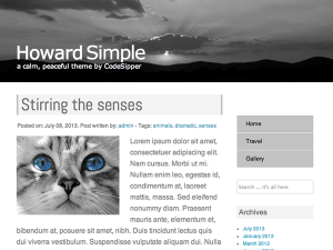
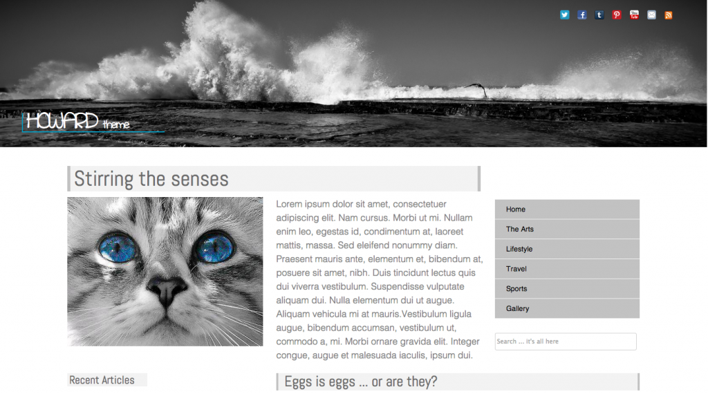
My static site is now almost complete and I’ll be uploading it as a WordPress Theme very soon. On the sample site I have tried to compliment an easy on the eye gray and white color scheme with some spot color. There’s a feature article section on the main page, together with the last 3 or 4 articles including any videos. Older articles can be accessed through a sidebar thumbnail preview section with their headings and the first few lines. Below this you have both Twitter and Facebook feeds.

On the header you have a full width image together with full social network navigation, email link and an RSS feed. Site navigation is accessed through a clean uncluttered sidebar with a site search box below.

I hope you like the look, soon you will be able to go to WordPress Themes, search for Howard Theme and download it. I’ll let you know as soon as it’s available.

Looking inside WordPress

May 31, 2013.

2 Comments

wordpresseyeOne of my goals is to become a good WordPress theme developer. There are some amazing themes out there by some very talented developers covering as many styles and walks of life you could ever imagine. I strive to join them.

WordPress is an incredible platform that was founded by Matt Mullenweg and Mike Little back in 2003, as an open source blogging platform. 10 years on it is so much more than that, still open source but would you believe that it now powers more than 17% of all websites on the Internet. That totals to more than 66 million websites, here’s just a few of them you may have heard of. CNN, NBC Sports, Forbes, Yahoo!, The New York Times, Ford, Flickr, TechCrunch, eBay, UPS, Sony, Reuters, these are all WordPress VIP customers. Now that’s an impressive list.

I’m currently working on a theme I’m calling “Howard Theme” and hope to have it up and running and ready to download pretty soon. I’m trying to make it very clean and clear looking but also having a visual impact that draws you inside to navigate around it. I see so many sites that are cluttered and heavy on the eye, they just make me want to move on quickly. I feel the essence of a good site is ease of navigation with a clear and uncluttered look.

Once I have the static site how I want it I will upload it as a WordPress theme and see what users think of it. Hopefully I’ll get a few downloads. I’ll let you know!

RECENT POSTS

  • Hello Mudder . . . .
  • How often should you redesign your site?
  • The Benefits of Responsive Design
  • It’s time to plug-in your timeline
  • WordCamp Vancouver? … magnifico!

ARCHIVES

  • January 2014
  • November 2013
  • October 2013
  • August 2013
  • July 2013
  • June 2013
  • May 2013
  • April 2013
  • March 2013

© 2025 CodeSipper

Back to the Top

Bottom Navigation

  • home
  • projects
  • about
  • blog
  • contact